
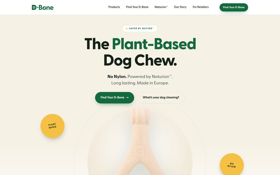
Product Hero
Premium-minimal. The Wishbone is the star from the first pixel.
Big, confident product staging on white and cream, oversized display typography, a strong centred grid and generous whitespace. The lowest-risk, most commercial direction — instantly credible and easy to extend across the rest of the site.
Open concept A →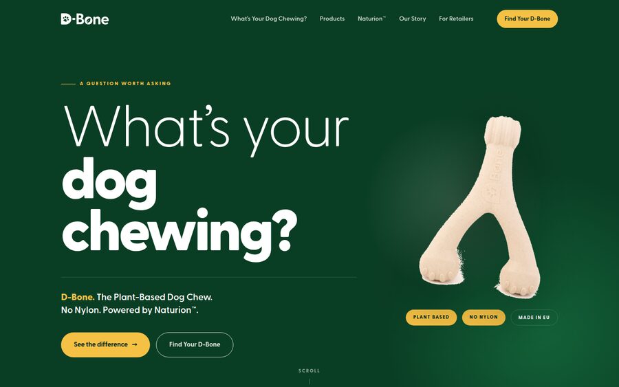
What’s Your Dog Chewing?
Curiosity-first. The page opens on the question, not the product.
A scroll-driven editorial narrative in numbered chapters: question → realisation → nylon vs plant based → D-Bone as the answer → the range. Asymmetric layouts, bold typographic contrast, deep-green ground. Curious and confident — never scary.
Open concept B →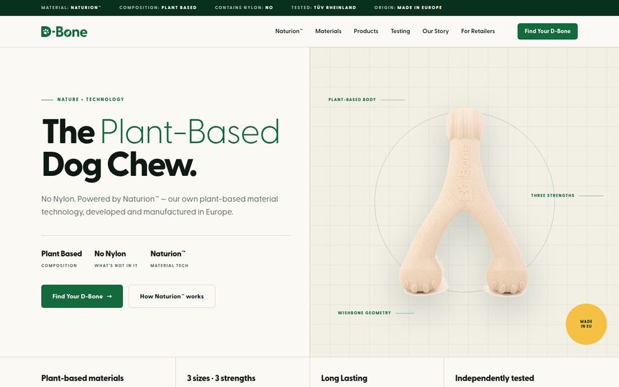
Nature + Technology
The material is the hero. Naturion™ told as engineering.
Blueprint grids, hairline rules, spec codes and measurement callouts used as design elements. The Naturion™ story leads the page and the comparison becomes a spec matrix. Reads like a materials-innovation company that makes a beloved dog product.
Open concept C →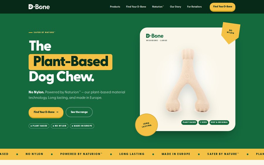
Retail Energy
Packaging-led and dog-first. The shelf presence, come alive.
Green is the ground, not the accent — product cards, sticker badges and colour-blocked panels sit on it like packs on a shelf. Yellow circle badges and a NO NYLON shield carry the claims, the strength scale becomes three bold colour blocks, and the Wishbone card switches size on click. The boldest, warmest and most joyful of the four.
Open concept D →